 tsquare
The language
A tsquare file (.tsq) describes one board: a canvas with one or more screens side by side, and optional notes beside them. This page covers how to write it. For what each component does, see Components.
board "Sign-up flow"
  screen phone "1 · Details"
    navbar "Create account" leading=back
    input "Name"
    input email "Email" placeholder="you@example.com"
    checkbox "I agree to the terms"
    button primary "Continue" fullWidth
  screen phone "2 · Done"
    heading "You're in" level=1
    text "Check your inbox to confirm your email." muted
  note "Confirmation email copy is TBD" color=pink
Lines and indentation
- One element per line. The line starts with the component name, in lowercase.
- Children are indented two spaces under their parent. A screen's children stack from top to bottom.
- The first line is the board. Everything else is indented under it.
- Blank lines are ignored.
Anatomy of a line
button primary lg "Sign in" fullWidth leadingIcon=log-in| Part | What it does |
|---|---|
button |
the component |
primary, lg |
bare words that set options: primary sets variant, lg sets size |
"Sign in" |
a quoted string sets the component's main text: a button's label, a heading's text, a screen's name |
fullWidth |
a switch: naming a yes/no prop turns it on |
icon=log-in |
key=value sets any prop |
The order doesn't matter. button "Sign in" lg primary is the same button.
Quoted strings
Use double or single quotes: "Sign in" or 'Sign in'. Inside quotes, write \" for a quote character. Each component has one main-text prop, marked main text on its component page; a quoted string always fills that one. Components without one (such as stack) don't take a quoted string.
icon and avatar also accept their main text as a bare word: icon search, avatar JD.
Bare words: options and switches
A bare word is one of a component's option values (phone, primary, row, sm, bottom…) or the name of a yes/no prop (checked, fullWidth, grow, muted…). Each component page lists the words it accepts under Writing it.
To turn a switch off, write no- in front of it (no-dividers), or use off and unchecked for toggles and checkboxes: toggle "Wi-Fi" off, checkbox "Remember me" unchecked.
If a word is an option of two props, write which one you mean. On a stack, center could be align or justify, so write align=center or justify=center.
key=value
key=value works for every prop. Values can be:
| Value | Example |
|---|---|
| a quoted string | placeholder="you@example.com" |
| a single word | value=Travel, icon=arrow-left (see Icons) |
| a number | gap=12, width=240 |
true or false |
dividers=false |
| a list | items=[All notes, Pinned, Shared] |
| an object | {label=Home icon=house} |
| a color | accent=#1a73e8 |
Lists
Lists go in square brackets, with items separated by commas. An item can contain spaces without quotes:
    tabs items=[All notes, Pinned, Shared]
    table columns=[Name, Role, Status] data=[[Ana Torres, Admin, Active], [Ben Cho, Editor, Invited]]
To put a comma inside an item, quote the item: ["$1,200", "Smith, J"]. A number in a list of text is fine: tabs items=[2023, 2024].
A missing comma joins two items into one: actions=[search bell] is a single item, "search bell".
Objects
Objects go in curly braces, as key=value pairs separated by spaces (commas are also fine). A bare word turns an option on, as on an element line. Tab bars use a list of objects:
tabbar items=[{label=Home icon=house}, {label=Search icon=search}] active=0A list can also mix plain items and objects, when only some items need options. Bullets do this to change one line:
bullets icon=check items=[Unlimited boards, Share links, {label="SSO" icon=x muted}]Comments
A line that starts with # is a comment. A comment must be on its own line: it can't follow an element on the same line.
board
  # the main screen
  screen phone "Home"
Anywhere else, # is ordinary text, so order numbers, tags and hex colors need no quotes: [#1001, #1002], accent=#1a73e8. A # after an element on the same line, as in screen phone "Home" # the main screen, is an error that points here.
Code fences
Lines starting with ``` are ignored, so a model's reply in a code block can be rendered as-is.
Structure
- The board is the root. Its children are screens, plus notes beside them.
- A screen is one view of the product. Its children stack vertically. Use several screens to show several views, states or steps.
- A navbar is pinned to the top of its screen, and a tabbar to the bottom.
- modal and drawer are overlays, drawn over the screen. They must be direct children of a screen, listed last.
- stack arranges its children in a
rowor a column; grid makes equal-width columns that wrap; card groups content in a box. - spacer without a size pushes what comes after it to the end: put one before a button to pin the button to the bottom of the screen.
Screens and devices
| Device | Size | Top bar |
|---|---|---|
phone (default) |
390 × 844 | status bar |
tablet |
820 × 1180 | none |
desktop |
1280 × 800 | browser bar |
custom |
width × height, default 800 × 600 |
none |
Turn the top bar on or off with chrome or no-chrome. width and height override any device's size: screen phone "Article" height=1400 is a phone showing a long scrolling page.
Screens have a fixed height. Content that doesn't fit is cut off at the bottom, and nothing warns about it, so check the render. Split long content across screens, or give the screen a larger height.
Tooltips and open states
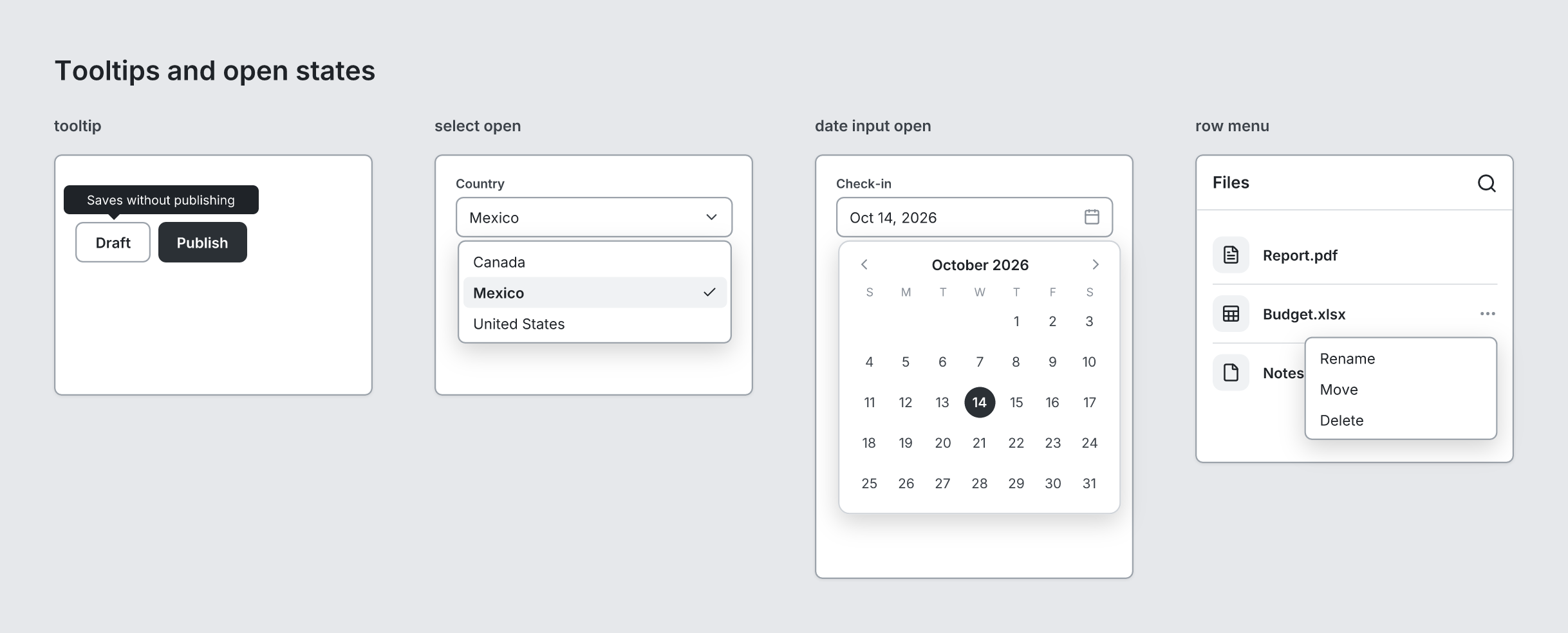
Any element inside a screen can show a tooltip (not the board, a screen or a note):
button secondary "Draft" tooltip="Saves without publishing"The tooltip sits above the element, or below it near the top of the screen, and points at it. A select, a date input and a button with a menu can be shown open. Their list, calendar or menu then covers what's below, as it would in the app:
    select "Country" value="Mexico" open options=[Canada, Mexico, United States]
    input "Check-in" type=date value="Oct 14, 2026" open
    button ghost leadingIcon=more-horizontal open menu=[Rename, Duplicate, Delete]
List items and the navbar take a menu too. A row's menu opens right-aligned under it; a row with nothing at its end shows … for it. The navbar's menu opens under a ⋮, added after its actions unless the last one already is one:
listitem "Budget.xlsx" subtitle="380 KB" open menu=[Rename, Move, Delete]open without anything to show (no options or menu) is an error that says what to add.
Flows
Arrows show how screens connect. Name an element or a screen by writing #name after it, then write each flow on its own line after the screens, indented like a screen (not inside one). An id is one word (letters, digits, - and _, starting with a letter), must be unique on the board, and ignores case, so #Home and flow … -> home match.
board "Sign-in flow"
  screen phone "Sign in" #signin
    button primary "Sign in" #submit
    button ghost "Create an account" #create
  screen phone "Home" #home
    heading "Welcome back"
    text lines=3
    button secondary "Sign out" #signout
  screen phone "Sign up" #signup
    heading "Sign up"
  flow submit -> home "Tap Sign in"
  flow create -> signup "New user" line=curved color=green
  flow signout -> signin dashed start=dot
A flow goes from one element or screen to another, with an optional label. Lines stay off screens they don't connect: an arrow to the next screen crosses the gap between the two, and one that skips a screen or goes back past one runs under the screens. When a labeled arrow crosses a gap, the gaps between screens widen so the label fits (unless the board sets gap=). Everything after the label is optional:
| Option | Values | Default |
|---|---|---|
start=, end= |
none, arrow, dot, circle, bar |
start=none, end=arrow |
line= |
rounded, hard (right angles), curved, straight (a curve or a direct line where the arrow stays beside its screens; under the screens they keep their corners) |
rounded |
dashed |
solid | |
color= |
an accent name, a hex color, or accent for the board's |
gray |
To show the same board without arrows, switch off Flows in the playground, or use tsquare render --no-flows, the { flows: false } option, or ?flows=0 on an image link.
Checking and errors
tsquare check file.tsq reports every problem with its line number, and suggests a fix where it can:
line 2: Screen: don't know what "watch" is (bare words it accepts: phone, tablet, desktop, custom, chrome); quote text like "watch"
line 3: unknown component "buton" (did you mean button?)
line 4: Card has no prop "colour" (its props: title, padding, gap, variant, grow, width)
line 5: Icon: unknown icon "serach" (did you mean search?)
line 7: Drawer must be a direct child of a Screen (found in the Stack on line 6)
line 8: Table has 2 columns, but data row 1 has 3 cells (quote cells that contain a comma, e.g. ["$1,200", Paid])
tsquare render refuses to draw a file with problems, so a wireframe never renders with a silent mistake.
Formatting
tsquare fmt file.tsq prints the file in a canonical form: bare words first, then the quoted text, then key=value. Add -w to rewrite the file. It drops comments.
Older wireframes
Wireframes written for an earlier version keep working:
- Renamed props are accepted under their old names. For example,
icon=on a button or list item, which isleadingIcon=since 0.3.0.tsquare fmtrewrites them to the current names. - Links made by an earlier version mean what they meant then. Opening an older share link or render URL upgrades its text first. For example, a comment after an element (allowed before 0.3.0) moves onto its own line.
The library exports the same step as upgradeWireframe(text), for tools that store wireframes themselves.
tsquare 0.9.0 · View this page on GitHub