 tsquare
ListItem
listitem · Navigation & data · All components
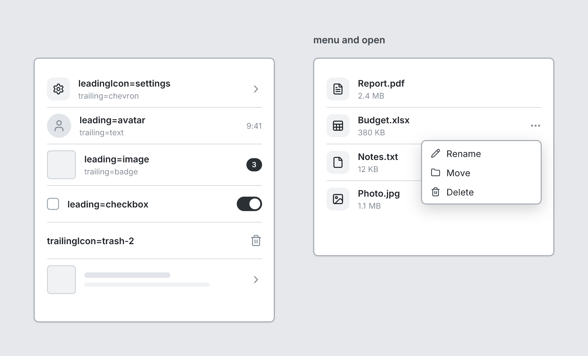
Row in a List. Omit title for a placeholder bar.
board
  screen custom width=400 height=440
    list
      listitem "leadingIcon=settings" subtitle="trailing=chevron" leadingIcon=settings trailing=chevron
      listitem "leading=avatar" subtitle="trailing=text" leading=avatar trailing=text trailingText="9:41"
      listitem "leading=image" subtitle="trailing=badge" leading=image trailing=badge trailingText="3"
      listitem "leading=checkbox" leading=checkbox trailing=toggle
      listitem "trailingIcon=trash-2" trailingIcon=trash-2
      listitem leading=image trailing=chevron
  screen custom "menu and open" width=400 height=330
    list
      listitem "Report.pdf" subtitle="2.4 MB" leadingIcon=file-text
      listitem "Budget.xlsx" subtitle="380 KB" leadingIcon=sheet open menu=[{label=Rename icon=pencil}, {label=Move icon=folder}, {label=Delete icon=trash-2}]
      listitem "Notes.txt" subtitle="12 KB" leadingIcon=file
      listitem "Photo.jpg" subtitle="1.1 MB" leadingIcon=image
Writing it
- A quoted string sets title:
listitem "…". - Bare words set leading:
avatar,image,checkbox. - Bare words set trailing:
chevron,toggle,text,badge. none,iconare options of leading and trailing, so write which one you mean:leading=noneortrailing=none.openturns open on;no-openturns it off.- Anything else is written
key=value. - Has no children.
Icon names: see Icons for the common ones and every name.
Props
| Prop | Values | Notes |
|---|---|---|
title (main text) |
string | |
subtitle |
string | |
leading |
none, icon, avatar, image, checkbox | |
leadingIcon |
string | Lucide icon on the left; setting it implies leading=icon |
trailing |
none, chevron, toggle, text, badge, icon | |
trailingText |
string | Text for trailing=text or badge; setting it implies trailing=text |
trailingIcon |
string | Lucide icon on the right; setting it implies trailing=icon |
menu |
array of string, { label: string, icon: string } | A menu for the row (shows … on the right if nothing else is there), shown when open |
open |
boolean | Show the menu |
tsquare 0.9.0 · View this page on GitHub