 tsquare
Button
button · Controls · All components
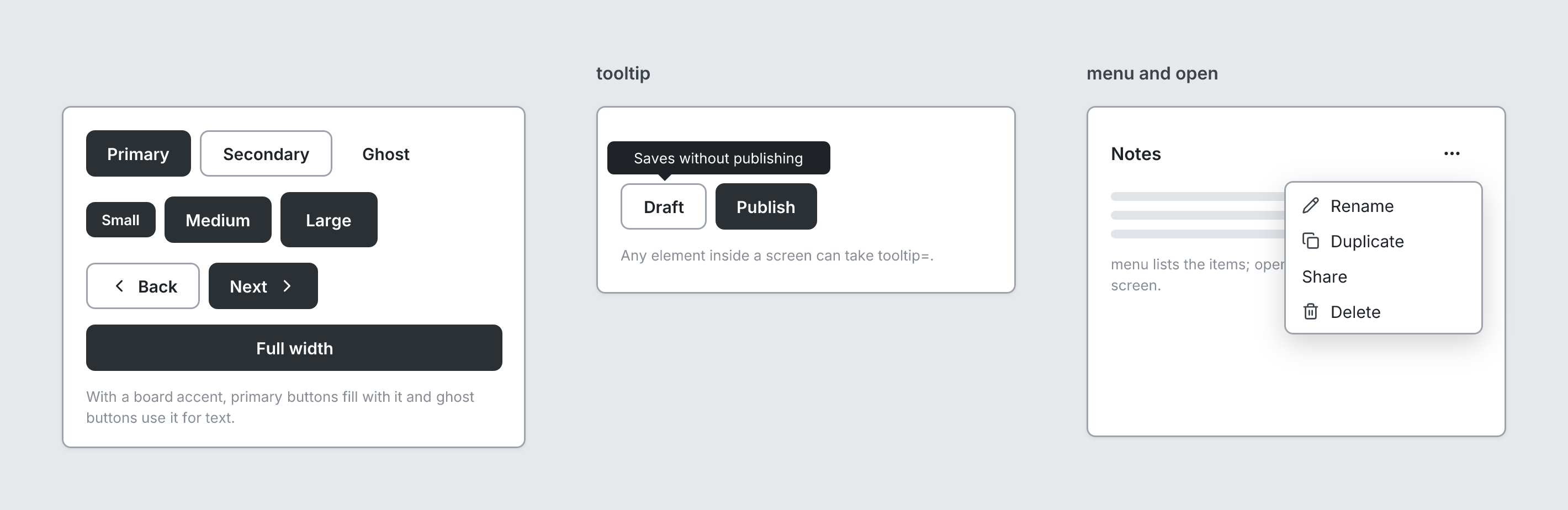
Button. Primary is filled, secondary is outlined, ghost is text only. With menu and open, a dropdown menu.
board
  screen custom width=420 height=310
    stack row gap=8 align=center
      button primary "Primary"
      button secondary "Secondary"
      button ghost "Ghost"
    stack row gap=8 align=center
      button primary sm "Small"
      button primary "Medium"
      button primary lg "Large"
    stack row gap=8 align=center
      button secondary "Back" leadingIcon=chevron-left
      button primary "Next" trailingIcon=chevron-right
    button primary "Full width" fullWidth
    text "With a board accent, primary buttons fill with it and ghost buttons use it for text." sm muted
  screen custom "tooltip" width=380 height=170
    spacer size=34
    stack row gap=8
      button secondary "Draft" tooltip="Saves without publishing"
      button primary "Publish"
    text "Any element inside a screen can take tooltip=." sm muted
  screen custom "menu and open" width=380 height=300
    stack row justify=between align=center
      heading "Notes" level=3
      button ghost leadingIcon=more-horizontal open menu=[{label=Rename icon=pencil}, {label=Duplicate icon=copy}, Share, {label=Delete icon=trash-2}]
    text lines=3
    text "menu lists the items; open shows them over the screen." sm muted
Writing it
- A quoted string sets label:
button "…". - Bare words set variant:
primary,secondary,ghost. - Bare words set size:
sm,md,lg. fullWidthturns fullWidth on;no-fullWidthturns it off.openturns open on;no-openturns it off.- Anything else is written
key=value. - Has no children.
Icon names: see Icons for the common ones and every name.
Props
| Prop | Values | Notes |
|---|---|---|
label (main text) |
string | |
variant |
primary, secondary, ghost | |
size |
sm, md, lg | |
leadingIcon |
string | Lucide icon before the label, e.g. chevron-left for Back |
trailingIcon |
string | Lucide icon after the label, e.g. chevron-right for Next |
fullWidth |
boolean | |
menu |
array of string, { label: string, icon: string } | Dropdown menu items, shown below the button when open |
open |
boolean | Show the menu |
tsquare 0.9.0 · View this page on GitHub